Reels now account for over 50% of the time users spend on Instagram, yet a significant portion of ad spend is wasted because vital messaging is obscured by the interface. You've likely experienced the frustration of a high-converting call-to-action being buried under the "Like" button or seeing an a...
Content
Reels now account for over 50% of the time users spend on Instagram, yet a significant portion of ad spend is wasted because vital messaging is obscured by the interface. You've likely experienced the frustration of a high-converting call-to-action being buried under the "Like" button or seeing an ad rejected by Meta Ads Manager for layout violations. It's a technical oversight that directly impacts your bottom line and prevents you from capitalising on Meta's projected 24.1% ad revenue growth in 2026.
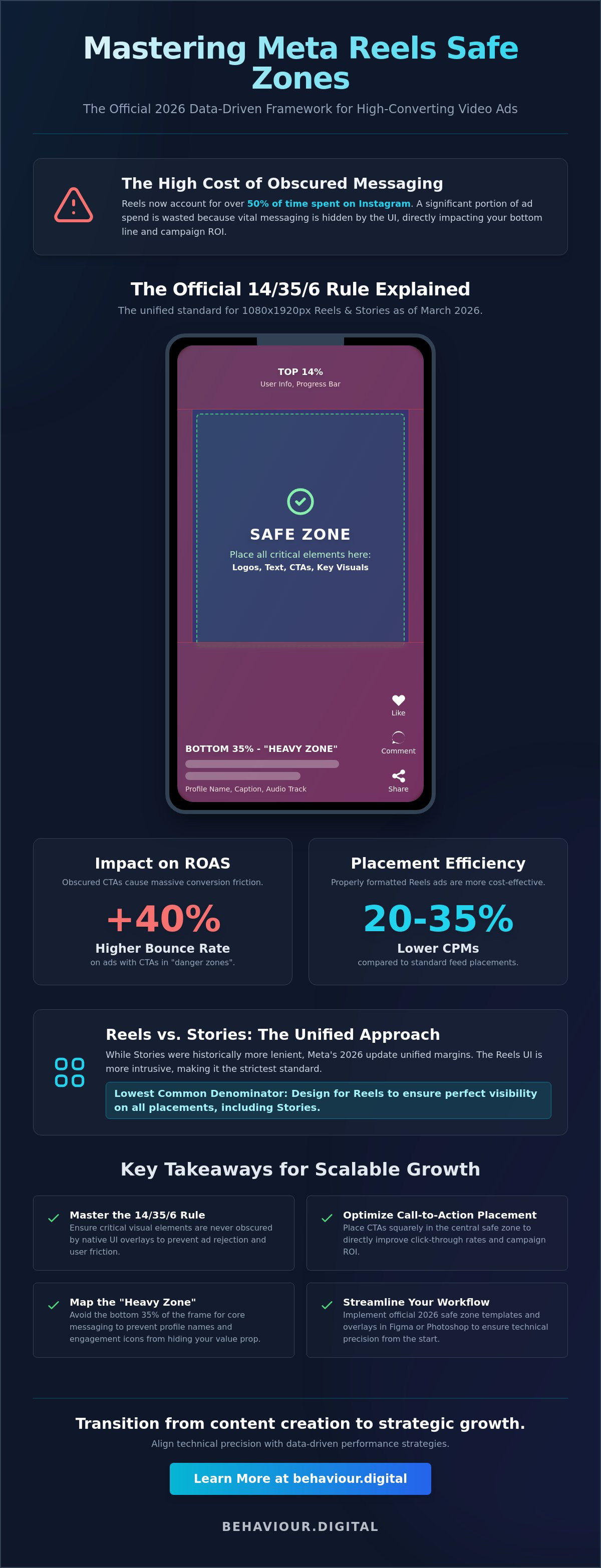
This guide provides the data-driven framework to master the meta reels safe zone 14% top 35% bottom 6% sides official specifications implemented as the unified standard in March 2026. By adhering to these precise margins, you'll ensure your 1080 x 1920 assets remain unobstructed across every device. We'll examine the technical "danger zones" and show you how to leverage the latest Safe Zone Guardrail tools to secure the 20-35% lower CPMs that Reels placements currently deliver compared to standard feed placements.
Key Takeaways
• Master the meta reels safe zone 14% top 35% bottom 6% sides official standard to ensure critical visual elements are never obscured by native UI overlays.
• Eliminate conversion friction by placing calls-to-action outside the "danger zones" to directly improve click-through rates and campaign ROI.
• Map the "Heavy Zone" in the bottom 35% of the frame to prevent profile names and engagement icons from hiding your core messaging.
• Streamline your creative workflow by implementing official 2026 safe zone templates and overlay layers in professional design software like Figma or Photoshop.
• Transition from basic content creation to scalable social growth by aligning technical precision with data-driven performance strategies.
Understanding the Meta Reels Safe Zone: The 14/35/6 Rule Explained
The 14/35/6 rule represents the definitive boundary for vertical video in 2026. To maintain visibility, you must leave the top 14%, the bottom 35%, and 6% of each side clear of critical information. Meta unified these margins across Facebook and Instagram in March 2026 to simplify the creative workflow for advertisers. This shift from pixel-based measurements to a percentage-based framework was a response to hardware diversity. With over 20 different smartphone aspect ratios in active use, a static pixel count no longer guarantees visibility. Percentages allow the UI to scale responsively across every device.
Designing for the meta reels safe zone 14% top 35% bottom 6% sides official layout prevents your "Shop Now" button from being obscured by the user's caption. Paid Meta Ads face stricter scrutiny than organic posts. While an organic Reel might occasionally get away with a slightly lower text placement, the Ads Manager Safe Zone Guardrail tool will flag and potentially reject assets that violate these boundaries. This technical precision is non-negotiable for performance-based marketing.
The Core Dimensions of Vertical Video
The industry standard remains a 1080 x 1920 pixel canvas with a 9:16 aspect ratio. However, the "Active Area" is significantly smaller than the full frame. While the background video should fill the entire 1080x1920 space, your text, logos, and calls-to-action must stay within the central safe zone. Modern smartphone screens are taller and narrower than older models. This hardware evolution led Meta to enforce the 14/35/6 margins to ensure content remains legible on everything from compact devices to large tablets. If you place text outside this central pillar, you risk losing the viewer's attention immediately.
Reels vs. Stories: Are the Safe Zones Identical?
Historically, Stories allowed for more creative freedom with 20% top and bottom margins. Since the Instagram's video features update in early 2026, Meta has pushed for a unified 35% bottom margin. The Reels UI is significantly more intrusive than the Stories interface. Reels include a persistent profile name, a music track label, and a stack of engagement icons on the right side. If you design your creative for the stricter Reels specification, it'll automatically perform perfectly in Story placements. We recommend this lowest common denominator approach to streamline production and maximise your digital strategy's efficiency.
Why the 14/35/6 Margins are Essential for Conversion Rate Optimisation
Technical precision in creative production directly dictates your return on ad spend (ROAS). When we discuss the meta reels safe zone 14% top 35% bottom 6% sides official standard, we aren't debating aesthetic preferences. We're discussing the removal of conversion friction. If a user's thumb covers your primary headline or the "Shop Now" button is layered beneath a caption, the user journey breaks immediately. Data from late 2025 indicates that ads with obscured calls-to-action suffer a 40% higher bounce rate compared to those with clear, unobstructed messaging. Precision drives profit.
Adhering to these margins is a fundamental component of any rigorous conversion optimisation strategy. High-performing creative must earn trust in the first 1.5 seconds. When an ad looks "broken" because text is bleeding into the UI, it triggers a subconscious bias against the brand's reliability. This "professionalism gap" is a measurable metric. Ads that respect the platform's native boundaries consistently earn higher engagement rates because they feel like native content, not intrusive errors. For a deeper look at the technical layout, this complete guide to safe zones details the specific UI elements that threaten your visibility.
The Psychology of Unobstructed Content
Visual hierarchy dictates where a user's attention lands. In a 9:16 environment, the viewer's eye naturally seeks the center of the screen. If your core message is fighting for space with the profile name or engagement icons, message retention drops significantly. The bottom 35% of the screen is effectively a "dead zone" for critical brand information. Meta's UI is densest here, containing captions, audio labels, and interactive buttons. If you place your hook in this region, you're essentially hiding your value proposition from the audience. Clean layouts lead to better brand recall.
Reducing Ad Waste Through Technical Precision
Meta's delivery algorithm is highly sensitive to early engagement signals. If your Reel has low legibility, users swipe away faster. This signals to the algorithm that the content is irrelevant, leading to higher CPMs and restricted reach. Wasted creative budget isn't just about the media buy; it's about the hidden cost of production. Getting the layout right during the initial edit prevents expensive re-shoots and delays in your campaign launch. We use safe zone adherence as a primary KPI for our creative production quality control. Ensuring your assets meet the meta reels safe zone 14% top 35% bottom 6% sides official requirements from day one is the most cost-effective way to scale your presence.
If you're looking to refine your creative output for better performance, our team can help you build a robust digital strategy.
Mapping the Meta Reels UI: What Sits in the Danger Zones?
Understanding the specific UI elements that occupy the meta reels safe zone 14% top 35% bottom 6% sides official layout is the only way to prevent creative overlap. While we've established the conversion impact of clean design, we must now map the specific platform overlays that threaten your messaging. The top 14% is primarily a navigation layer. It contains the camera icon, search functionality, and the toggle tabs for "Following" and "For You" feeds. If you place a brand logo or a secondary headline in this upper margin, it'll likely clash with these persistent platform icons, making both unreadable.
The right-hand side of the frame is significantly more dangerous than the left. This is due to the vertical stacking of the engagement rail. This rail includes the "Like" heart, comment bubble, share arrow, and the "Save" icon. Because these elements are anchored to the right, any text that extends into the 6% side margin will be sliced or covered. This creates a cluttered, unprofessional appearance that signals a lack of platform-specific intent. Precision matters. Clutter kills conversions.
The 35% Bottom Margin Breakdown
The bottom 35% of the screen is the most congested area of the Reels interface. It houses the profile name, the "Follow" button, the primary caption, and the audio track information. Since the March 2026 UI update, Meta has prioritised caption visibility. If your caption exceeds 125 characters, a "See More" button appears. When a user clicks this, the text expansion can obscure up to 50% of the screen. To protect your visual assets, keep all critical motion graphics and text overlays above this 35% threshold. This ensures your call-to-action remains visible even when the user interacts with the caption.
Side-Bar Interactions and the 6% Rule
The 6% side margin acts as a buffer against varied device screen aspect ratios and the right-side engagement rail. This margin is particularly critical for international ad campaigns. When translating English copy into languages like German or French, the text often expands by 20% to 30%. Without that 6% buffer, your translated headlines will bleed into the engagement icons or off the edge of narrower smartphone screens. Designing with this 6% "gutter" ensures that your messaging remains centered and legible regardless of the viewer's hardware or language settings. Consistent execution across these zones is the foundation of a scalable social media marketing strategy.
Practical Implementation: Designing for the Official 2026 Safe Zones
The transition from theoretical knowledge to technical execution requires a standardised workflow. Designing for the meta reels safe zone 14% top 35% bottom 6% sides official specification is most efficient when you build it into your master templates rather than checking it post-production. We recommend creating a dedicated "UI Overlay" layer in your design software. This layer should be a semi-transparent PNG that replicates the exact March 2026 Reels interface. By toggling this layer during the design phase, your team can instantly see if a headline is clashing with the "Like" button or if a logo is buried under the profile name. This proactive approach eliminates the friction of creative re-exports.
Step-by-Step Guide for Figma and Canva
In Figma, start by creating a 1080x1920 frame. Use the Layout Grid feature to set horizontal rows. Create a top row at 14% (approximately 269 pixels) and a bottom row at 35% (approximately 672 pixels). For the sides, set a 6% margin (65 pixels) on each edge. In Canva, you can achieve this by selecting "File," then "View Settings," and "Add Guides." Manually input these percentage-based values to create a permanent safe zone frame. Using "Components" to toggle the UI overlay on and off ensures that your designers always have a clear view of the final user experience without cluttering the workspace.
Testing and Verification in Ads Manager
Once your assets are uploaded, use the "Advanced Preview" feature in Meta Ads Manager. This tool is essential because it displays how your 9:16 Reel will be cropped into a 4:5 aspect ratio for the Instagram Feed. To maintain legibility in both placements, you must keep your most critical messaging within the center 1080x1350 area of the frame. The Safe Zone Guardrail is a real-time visual overlay in Meta Ads Manager that highlights blocked regions during the ad setup phase to prevent UI interference. If you discover a minor violation during this stage, use Meta's internal "Crop and Trim" tool to shift the vertical alignment of your video. This can save hours of production time while ensuring your creative meets the 14/35/6 standard.
Precision in these final steps is what separates high-performing campaigns from wasted ad spend. For businesses looking to scale their social presence with technical excellence, our Social Media Marketing experts can audit your creative workflow to ensure maximum impact.
Beyond Design: Strategic Creative Management with Behaviour Digital
Technical mastery of the 14/35/6 margins is merely the baseline for performance. While understanding the meta reels safe zone 14% top 35% bottom 6% sides official specifications prevents UI interference, true growth requires a shift from technical compliance to strategic creative testing. At Behaviour Digital, we treat these technical boundaries as a non-negotiable foundation. Our approach to Social Media Marketing Management Scotland integrates these constraints into a rigorous, data-driven framework. We don't just ensure your text is visible; we ensure your message is effective.
A successful Digital Strategy in 2026 demands constant iteration. We perform monthly creative audits for high-growth Meta accounts to identify where technical precision meets user behaviour. This involves reviewing every asset against current platform updates and performance metrics. If an ad is underperforming, we look beyond the surface level. We analyse whether the creative hook was lost in a "danger zone" or if the narrative failed to resonate. This level of scrutiny ensures that your creative budget is always allocated to assets that are technically perfect and strategically sound.
Data-Driven Creative Scaling
Moving from a "safe" design to a high-performance narrative requires granular data analysis. We go beyond basic engagement metrics to study user drop-off rates and visual heatmaps. If data shows a significant exit at the three-second mark, we investigate whether UI elements like the "See More" caption expansion obscured a critical visual cue. As a specialised PPC agency Glasgow, we bridge the gap between technical production and media buying. We use these insights to refine the meta reels safe zone 14% top 35% bottom 6% sides official layout for your specific audience, ensuring your hooks land exactly where the eye is naturally drawn.
Partnering for Scalable Social Growth
Managing the technical overhead of modern social creative is a full-time demand. Our partners rely on us to handle the complexities of aspect ratio variations, safe zone compliance, and placement-specific optimisations. This allows your internal teams to focus on core business operations while we manage the technical-creative bridge. Transparency is the cornerstone of our partnership. Every creative test and layout adjustment is documented and reported, showing the direct impact of technical precision on your total conversion volume. Success is a result of conscious strategy and continuous refinement, not luck.
Scaling Your Social Performance with Technical Precision
Adhering to the meta reels safe zone 14% top 35% bottom 6% sides official standard isn't just about avoiding ad rejections. It's about ensuring every pixel of your high-value creative contributes to your ROI. By protecting your hooks from the top 14% navigation layer and keeping the bottom 35% clear of critical brand assets, you eliminate the friction that drives up bounce rates. Data from 2026 shows that ads respecting these unified margins deliver 20-35% lower CPMs by maintaining consistently high engagement signals.
Technical accuracy is the essential first step toward scalable growth. As Glasgow-based experts in Social Media Marketing, Behaviour Digital manages high-scale Meta campaigns for leading UK brands. We don't rely on luck; we use a data-driven approach to creative performance that turns technical specifications into competitive advantages. If your current creative workflow isn't producing the measurable results your business requires, it's time to align your strategy with platform reality.
What is the official Meta Reels safe zone for 2026?
The official meta reels safe zone 14% top 35% bottom 6% sides official standard was unified across the ecosystem in March 2026. This requires designers to leave a 14% margin at the top, a 35% margin at the bottom, and 6% on each side. Adhering to these percentages ensures that your core messaging remains visible across all 20+ active smartphone screen aspect ratios.
Does the 35% bottom margin apply to Instagram Stories as well?
Yes, the 35% bottom margin now applies to both Reels and Stories. Meta unified these specifications in early 2026 to help advertisers create a single asset that works across both placements. While Stories have less native UI clutter, designing for the stricter 35% Reel margin prevents your content from being obscured when used in cross-platform campaigns.
Can I use the same creative for both Facebook and Instagram Reels?
You can and should use the same 9:16 creative for both platforms. The meta reels safe zone 14% top 35% bottom 6% sides official layout is the universal requirement for both Facebook and Instagram Reels as of 2026. This unified approach reduces your creative production overhead and ensures a consistent visual experience for users as they move between apps.
What happens if my ad text falls outside the safe zone?
If your text falls outside these zones, it will either be covered by platform elements or result in an ad rejection. Meta Ads Manager now automatically flags layout violations during the upload process. Beyond rejections, obscured text creates a 40% higher bounce rate because users can't read your call-to-action or headline through the "Like" and "Comment" buttons.
Is there an official Meta template for safe zones?
Meta provides a real-time "Safe Zone Guardrail" tool within the Ads Manager interface. While there isn't a single downloadable file, this tool overlays the 14/35/6 margins directly onto your creative during the ad setup process. For external design, you should manually set these guides in Figma or Photoshop using the percentage-based measurements we've outlined.
How do the safe zones change for 4:5 aspect ratio videos?
For 4:5 aspect ratio videos, the safe zones are even more restrictive. When a 9:16 Reel appears in the Instagram feed, it is cropped to a 4:5 frame. To ensure your message survives this crop, you must center all critical text and visual elements within the middle 1080x1350 pixel area of your original 1080x1920 canvas.
Why is the bottom safe zone so much larger (35%) than the top (14%)?
The bottom margin is larger because it's the most congested interaction area on the platform. It must accommodate the profile name, the "Follow" button, the primary caption, and the audio track label. If the user expands a long caption, it can cover up to 50% of the screen. The 35% buffer is the minimum required to keep your content readable.
Can I ignore safe zones for organic Reels?
Ignoring safe zones for organic Reels is a mistake that costs you engagement. While organic posts aren't subject to Ads Manager rejections, content that is covered by the UI feels unprofessional and untrustworthy. Internal data from 2025 shows that organic Reels respecting the 14/35/6 rule see a 25% increase in average watch time compared to cluttered alternatives.
.png)


.svg)

.svg)


.png)

.svg)